LULULEMON
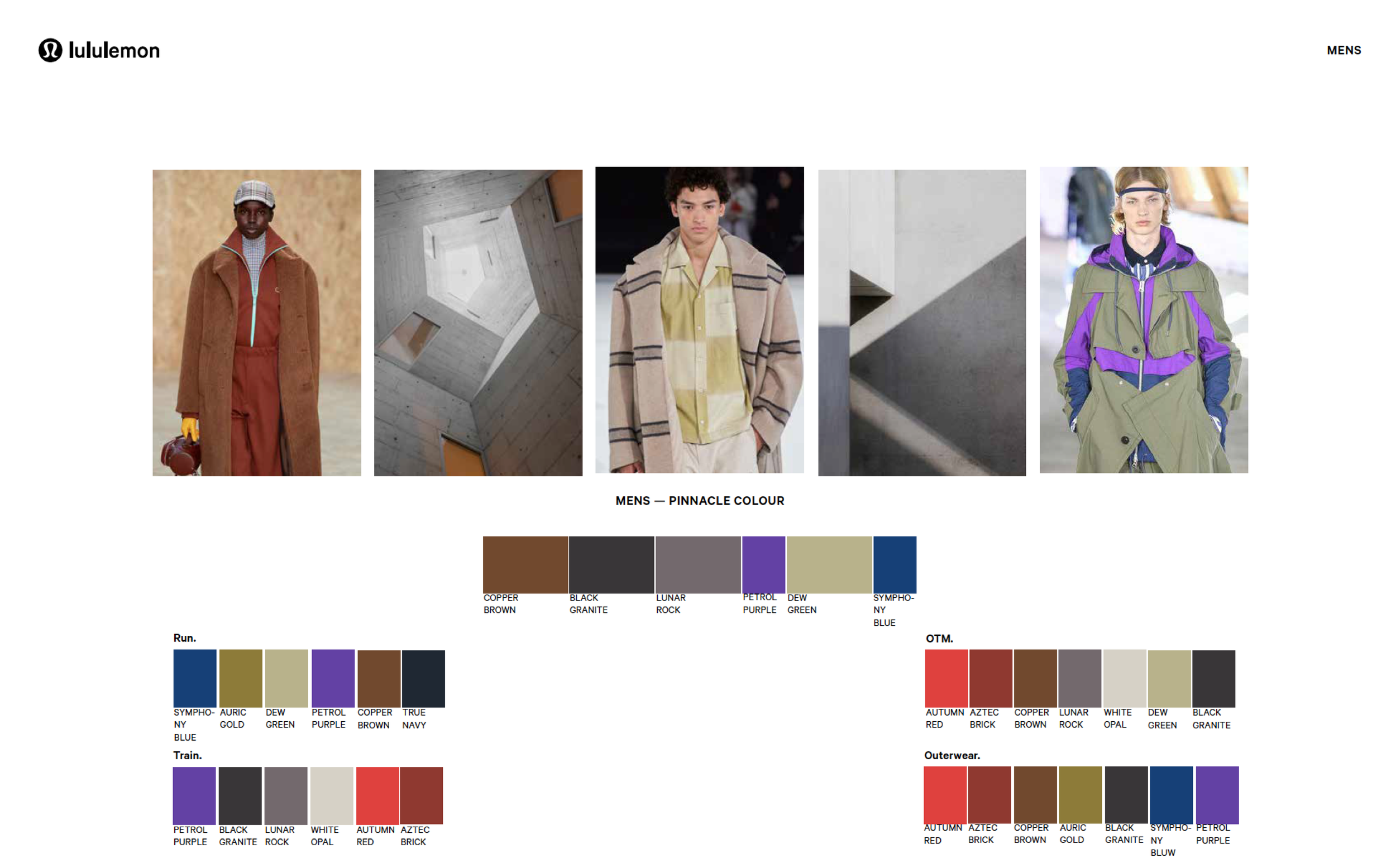
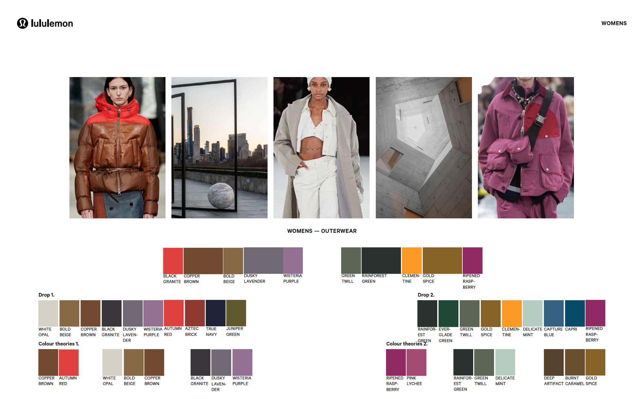
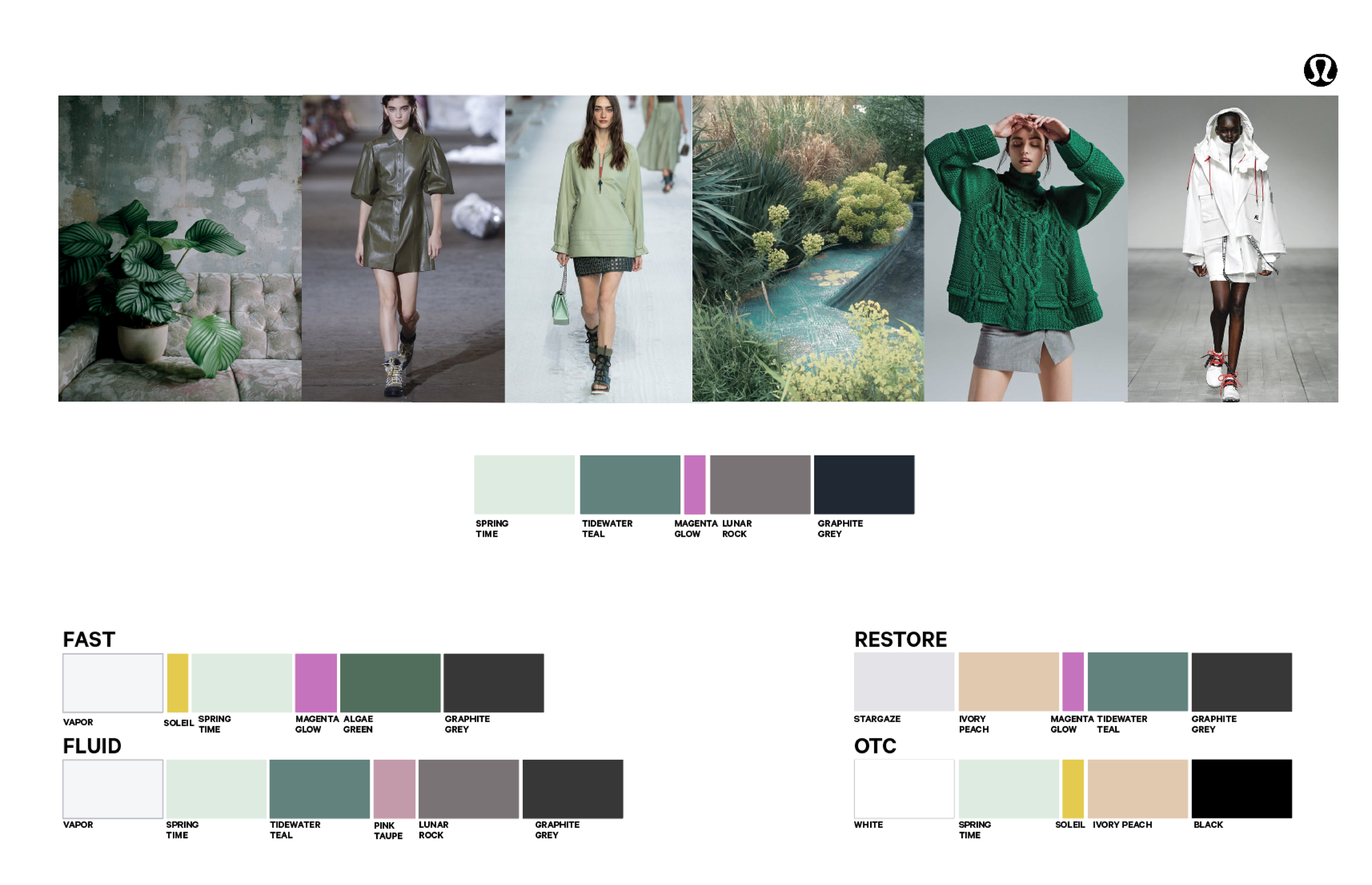
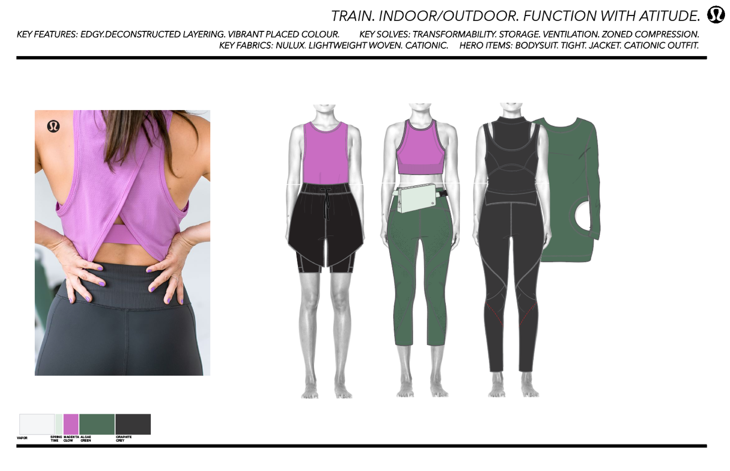
As a colour consultancy, we work closely with brands to shape cohesive, emotionally resonant colour palettes and print stories that carry through every touchpoint. For Lululemon, this meant building a unified colour system across all brand units—strengthening recognition while still allowing each category to feel thoughtful and intentional. By establishing a clear core palette framework, we helped streamline product development, support cost efficiencies, and create long-term colour consistency that could evolve while staying true to the brand.
Services
Colour + Concept